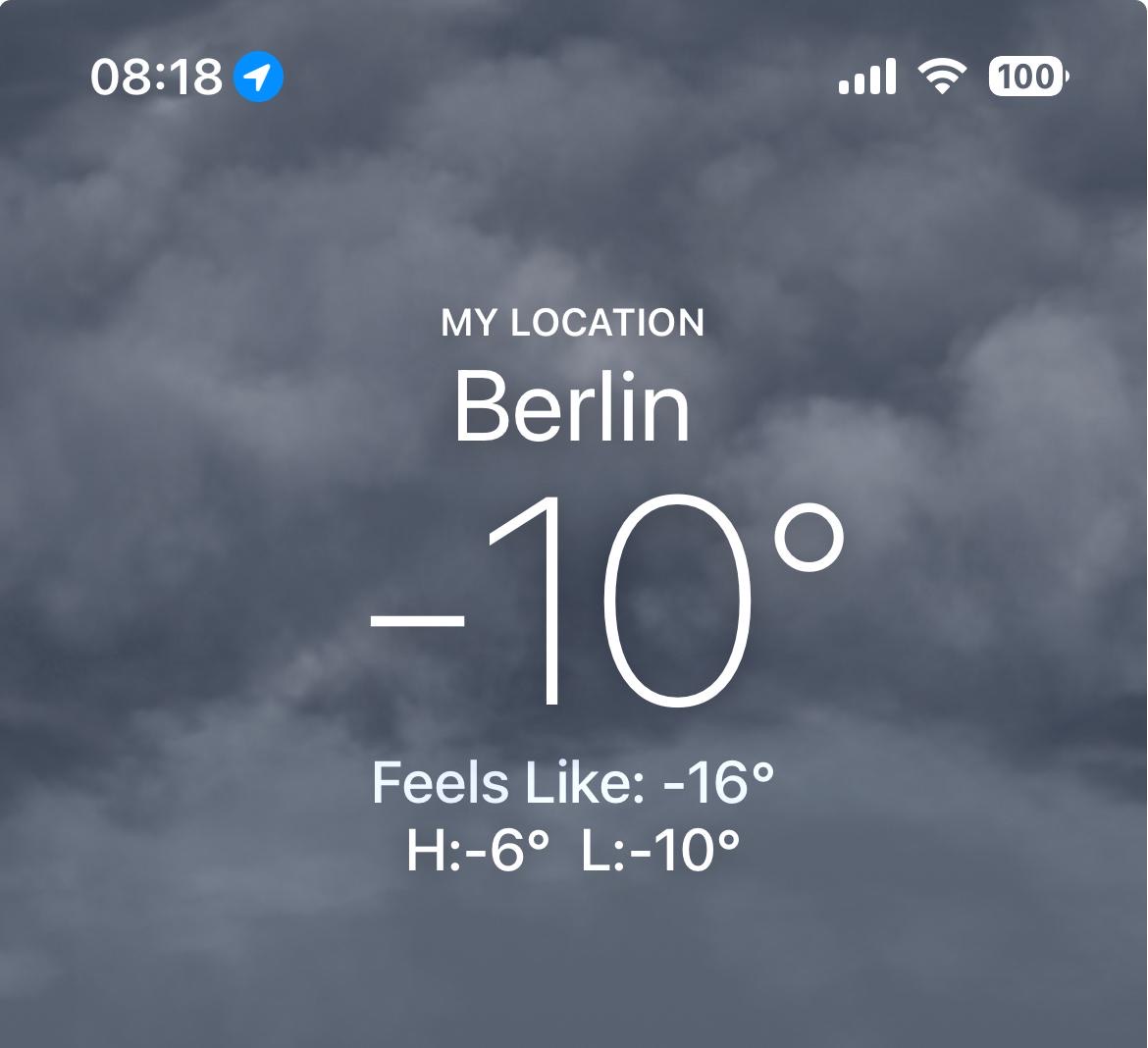
My friend in Berlin sent me a weather screenshot showing -10°C, feels like -16°C. Along with this message:
“Friends, this is Berlin right now. If it feels like -16, why show -10? Just write what it actually feels like so we can prepare accordingly.”
It’s a reasonable complaint.
What are we measuring? Why show two numbers? And what does this small frustration tell us about the relationship between data and lived experience?
Measurement
Every measurement is a lossy compression of reality.
When we say “-10°C,” we’ve collapsed an infinitely complex thermodynamic system into a single number. We’ve chosen a point in space (where exactly is this sensor?), a moment in time (08:18, but which second?), and a unit system anchored to the freezing point of water (an arbitrary reference).
The “feels like” metric reveals something uncomfortable about measurement: the thing we actually care about is often not the thing we can directly measure. So we build proxies.
Wind chill is a model. It calculates heat loss from exposed skin, assuming a human face, assuming you’re walking, assuming certain physiological constants. It transforms the measurable (air temperature, wind speed) into something closer to the meaningful (how cold you will feel).
Each transformation introduces assumptions, where values hide.
A colleague from Canada pointed out that outdoor clothing there comes with temperature ratings: boots rated for -20°C, coats rated for -30°C, extreme gear rated for -45°C. The “feels like” number tells you which boots to wear before you step outside and find out the hard way.
The practical utility is real. You can’t “feel your way” into frostbite.
While researching the “feels like” metric, I learned that the wind chill formula used by meteorological services was revised in 2001. The old formula, dating back to Antarctic research in the 1940s, was replaced with a new model based on modern heat transfer theory and human trials. Before and after the revision, the same wind and temperature produced different “feels like” numbers.
The weather didn’t change. Our story about the weather changed.
This is the data practitioner’s condition: we measure what’s measurable, then transform it toward what’s meaningful.
Meaning
Alan Watts might have approached this differently. Where the data scientist sees a modeling problem to solve, Watts would see a confusion worth examining. I can almost hear him:
You see, the problem with the ‘feels like’ temperature is that it doesn’t ask the most important question: feels like to whom?
The meteorologist has performed a wonderful magic trick. They’ve taken your shivering, your intimate relationship with this particular morning, and they’ve abstracted it into a number that applies to everyone and therefore no one. They’ve replaced your cold with the cold.
And now your friend looks at the screen and says, ‘Just tell me what it feels like!’ But don’t you see the comedy? You already know what it feels like. You’re the one feeling it.
Think about how far removed we’ve become from the knowledge that let humans survive cold climates for thousands of years without wind chill indices. There was a time when people read the sky, felt the wind direction, knew their local terrain and microclimates. The knowledge was embodied, accumulated across generations, specific to place.
Now we have a universal formula. It works anywhere. It requires no local knowledge, no embodied skill, no relationship with a particular landscape. This is genuine progress: more people survive extreme cold thanks to this.
And yet something got lost along the way. People used to know their weather. Now they check it.
Watts wouldn’t say we should throw away our weather apps. He’d invite us to notice the trade-off. We’ve gained precision and lost participation. We know more about cold and feel it less.
The “feels like” temperature is the universe’s little joke on measurement: an admission that the objective number missed something essential.
The Gap
So why show both numbers?
Because neither alone tells the whole story. The raw measurement gives us comparability, history, science. The “feels like” gives us utility, preparation, survival. Showing both admits: we haven’t reconciled these truths, and maybe we shouldn’t try.
The data scientist and the humanist are both pointing at the same thing: between the measurement and the meaning, there is a gap.
The data scientist tries to close the gap with better models, more variables, and higher precision. The humanist suggests the gap cannot and shouldn’t be closed. The gap is where interpretation lives. Where experience lives. Where you differ from a sensor.
My friend’s complaint is asking for the impossible. No number can tell you what it feels like to be you, in your coat, with your circulation, walking your route to work, on this particular morning.
The best a metric can do is offer a hint. A starting point for a decision only you can make.
The weather app cannot tell you if you’re warm enough. Only you can answer that.